
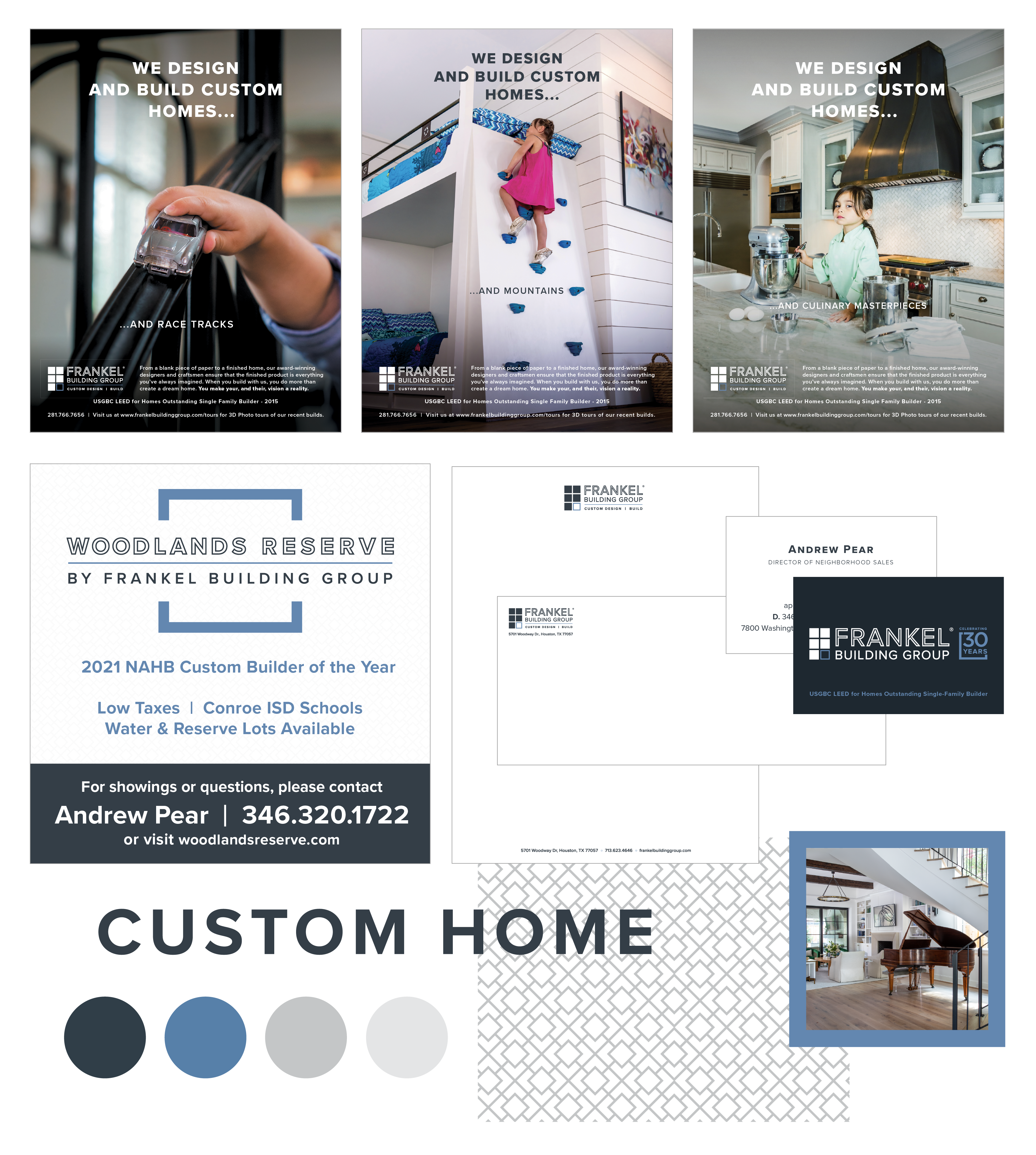
A Facelift for a 30-Year-Old
Tasked with rebranding a custom home builder with thirty years of brand equity, our approach was to isolate one element of the previous “window” logo. The goal was to modernize the brand identity to better align with a younger client demographic and more “transitional” home styles, with a focus on women as the primary demographic for engagement decisions.
Deliverables
Brand Identity
Website
Campaign Development
Art Direction
Inspiration
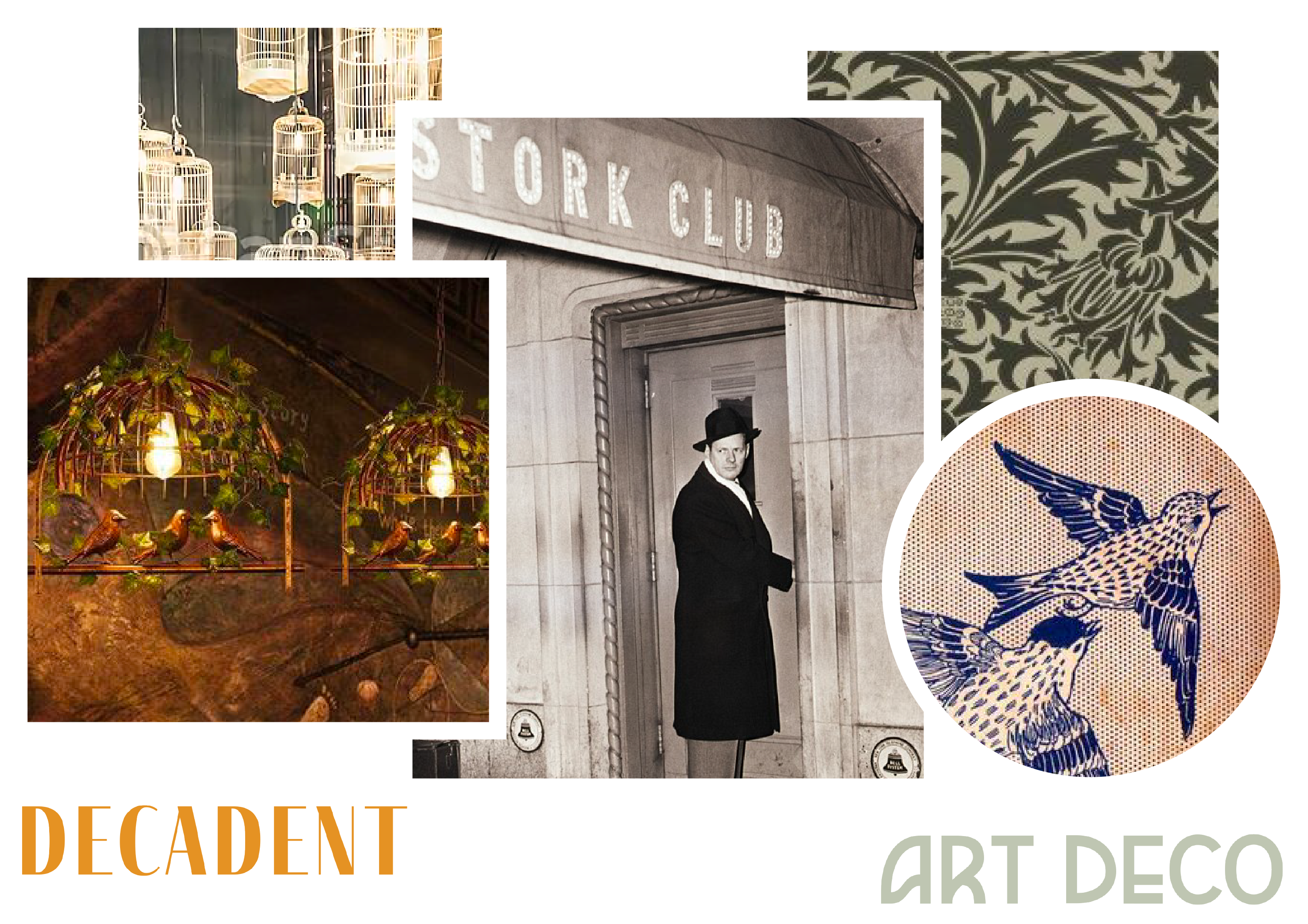
The Blind Finch brand concept is rooted in the history of speakeasies and speakeasy terminology. The finch has no eyes. He’s blind so that he does not see who or what happens in the bar. He is the protector of the secrets of the place, and turns a blind eye to the revelry that happens there, while ensuring no one gets out of line. He is strong and aggressive as a protector, but passive in his engagement with customers and prefers to stay in the shadows.
Color Palette

